
E*TRADE is the pioneer of online trading for retail investors.
Today, we are a leading online financial services firm that specializes in a first-class experience for the digitally inclined investor and trader, backed by personal professional guidance. The Company also has a high-tech custody platform for advisors and the industry’s #1-rated stock plan administration platform.
Myself + the small internal design team executed a full rebrand of the company through out work.

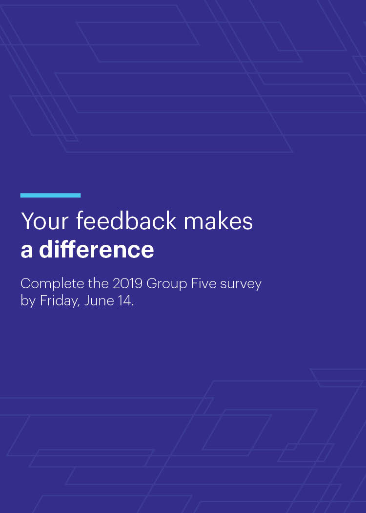

E*TRADE Corporate Services direct mail invitation
This project was straightforward, create a fresh new design for a direct mail piece. On this first version, I utilized angles present in our logo as a pattern to create movement throughout. The second design (below) was a much more simplified, and lighter iteration.


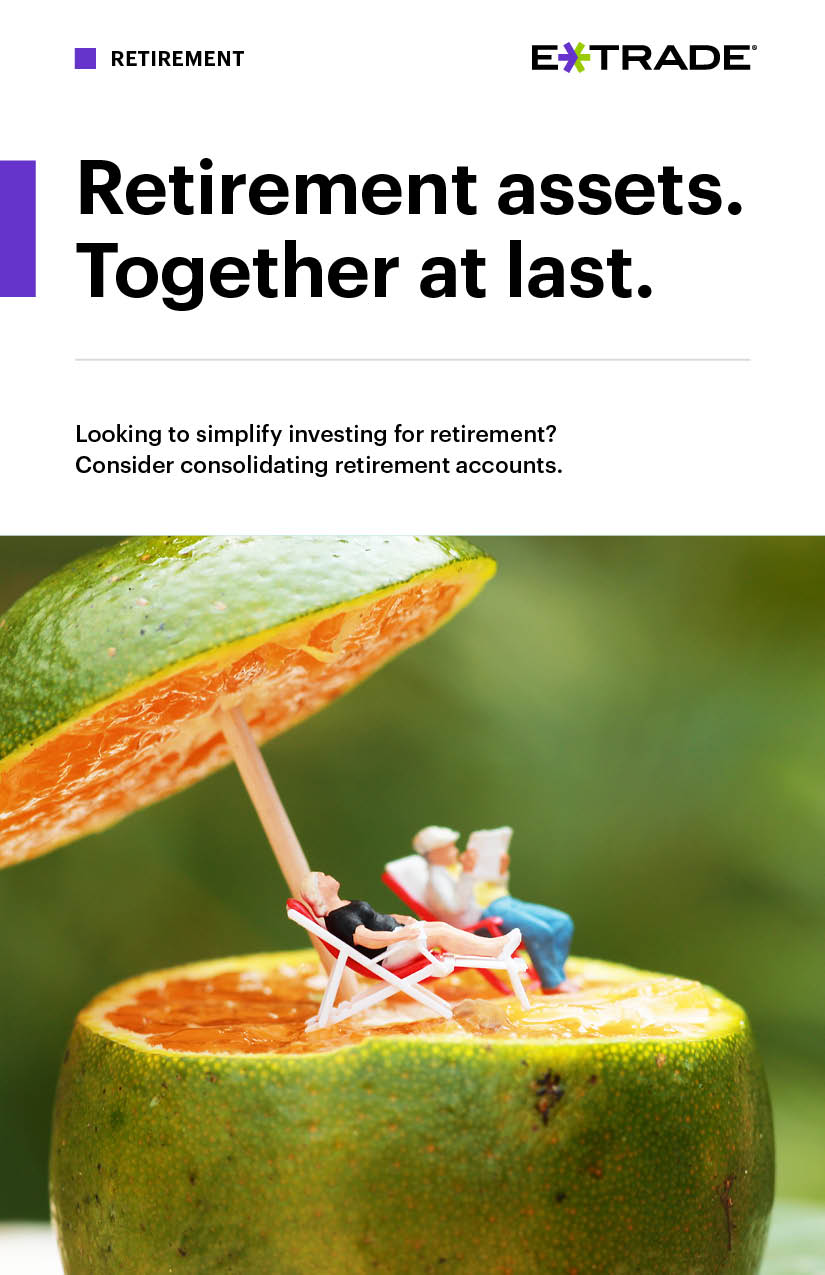


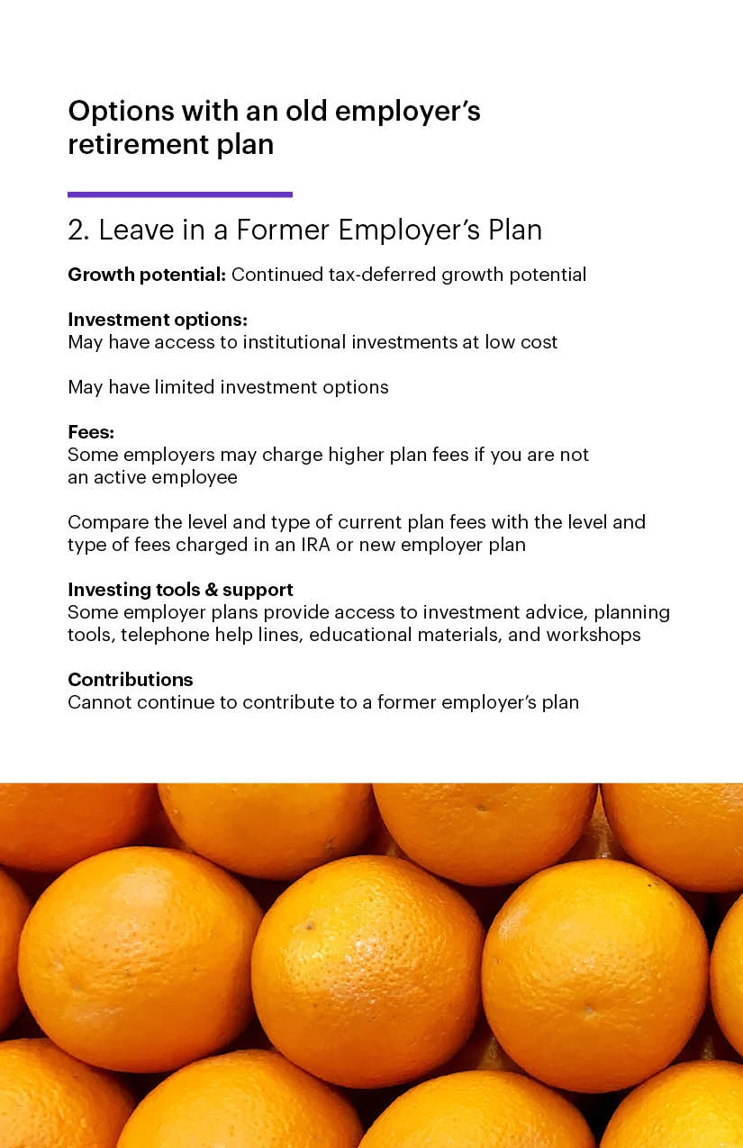
IRA consolidation brochure
This is print and digital design that informs our customers about retirement details. A “fruit” theme was carried throughout the document, symbolizing "retirement” savings. This was based on a new brochure template, but with slight alterations, since it was a “one off” creation.


Fixed income portfolios brochure
A nice, easy to digest brochure utilizing some requested “abstract” imagery on the cover.


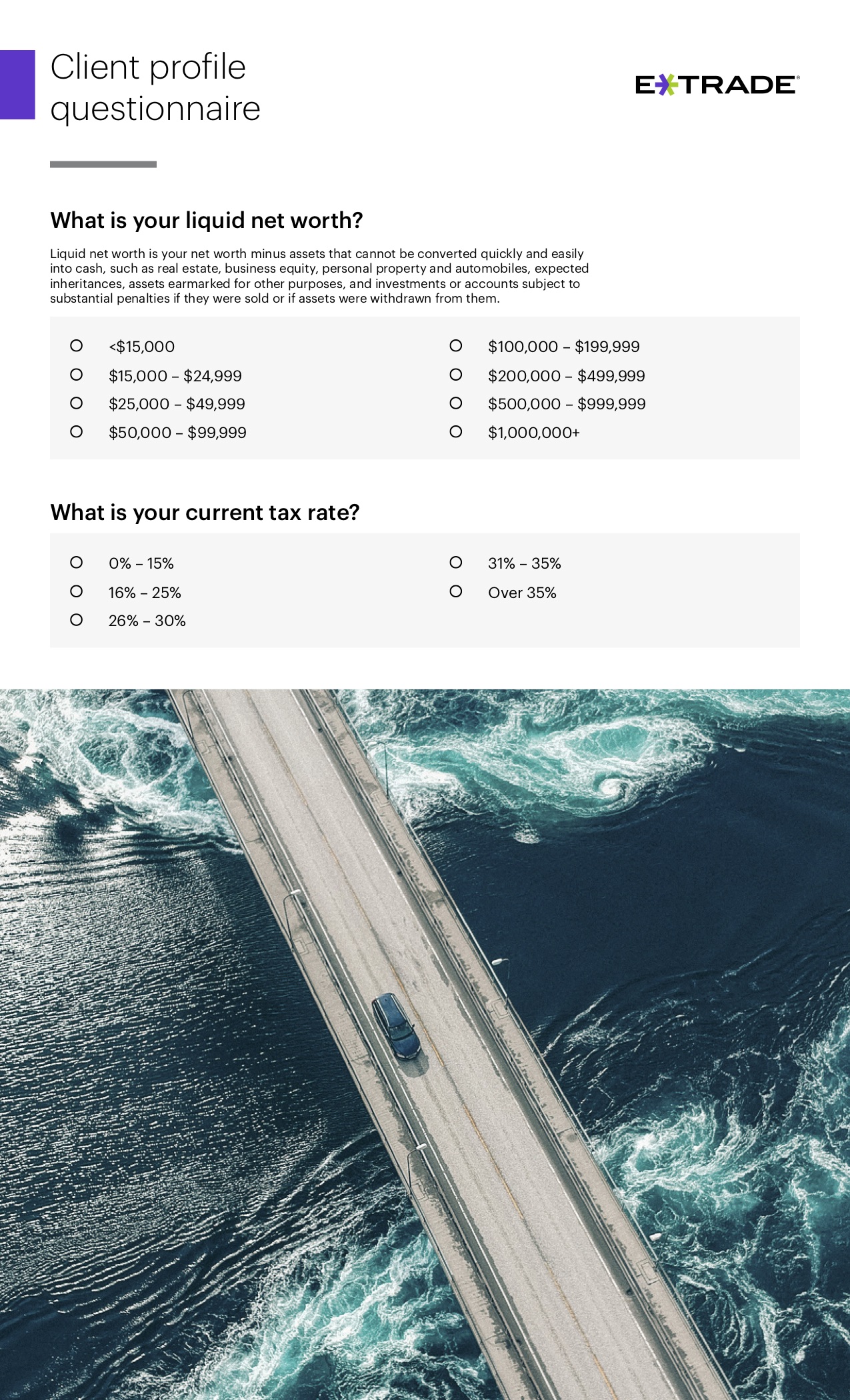
Client profile questionnaire
This was a fillable form that polled customers on a whole range of questions about their income. I added a multitude of imagery within, relating to travel (my favorite theme). Who said a form had to be boring?


Design portfolio
Our team wanted a way to show the work we have created internally, and this was the answer. All of the layout was directed by myself and carries our new branding through cohesively. It went through many iterations until we landed on this. Bonus: all of the pieces you are viewing were created by myself.


Email template redesign
Marketing department attempted to rework our current email template to something a little more exciting. This was my take on it. Unfortunately, none of our team’s versions actually passed the ringer, since it was such a huge ask. I am still hopeful this revamp can proceed in the next year or two.

Email template redesign (mobile)

Options Center trigger campaign
Here is an email in our standard template, with requested additional imagery to keep the content more engaging.

Options Center trigger campaign (mobile)

Email header redesign (dark)
Simple update of our email headers, utilizing (what we call) our pipe as a baseline design element. Simple and to the point.

Email header redesign (light)

Email header redesign (mobile dark)

Email header redesign (light mobile)

ETCS marquee (dark)

ETCS marquee (light)

ETCS marquee (dark alternate)

ETCS marquee (light alternate)

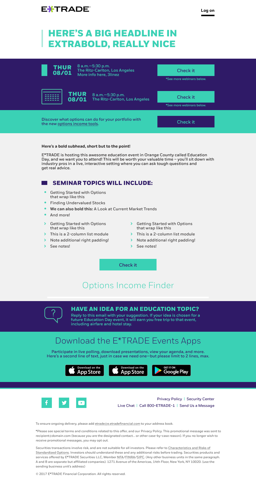
Event email module
This project was a simple ask to create a module for emails about events. The challenge was to make something that fits seamlessly within the content of our emails. The background image picks up the location that the event is happening at.

Event email module (mobile)

Event email module

Event email module (mobile)

Site banner and imagery update
This site was in desperate need of an imagery refresh. All of the choices carry symbolism that circles back to the copy, and also maintains a “travel” theme.

Site banner update
Easy update of one of our site’s banners. The constant challenge with these banner updates is that the user has such a narrow point of focus with the copy / login box. But this one worked out very nicely.


Video stills
This was an interesting ask. Our video tutorial pages always maintained the exact same thumbnails for every single video, so when you looked at them as a group, it was the same boring cluster that all blended together. We needed something that could be easily changed up visually using our brand colors. This was the answer. The first two versions were implemented, but I still really enjoy the others in this batch.


Branch digital signage (indoor)
This project was an expansive ask to create a large range of different digital signage. Many sizes, in both print and digital. These live all over the country in our “brick and mortar” E*TRADE locations.

Branch digital signage (outdoor)


Participant education posters
This project was informing the public about an in-store event that occurred. There were tons of iterations, but sadly none of them were approved due to the client being very particular about what they wanted. A much less ideal version was picked as the final product, but these were the strongest concepts.


Atlanta branch digital event poster
This project was an ask to create an ad for an Atlanta in-person event. The advertisement spanned over multiple screens in branches local to the area.

Atlanta branch digital event poster (alternate)
This was the original and approved version for the above ad, but we later found out that the screen setup unfortunately cut off the text in the middle.

Branch Relocation Materials
This project is an in-store signage series that is utilized when an E*TRADE branch is either remodeling or relocating. Many different sizes are utilized.

Branch Relocation Materials

Branch relocation materials


Patterns